
Purpose/Background
XYZ group is a supplier of Crafts and DIY kits to vendors such as Target, Walmart, Michaels etc.
They have two types of inventory that came in and out of their warehouse:
- Pick-pack: where they fill a box with parts in different combinations to produce kits
- Case in and Case out: Entire cases received and shipped out of the warehouse
Walmart, which was one of their main customers, was in process of implementing a policy where they would penalize deliveries from vendors that were not on time and in full. Since the Walmart account was a major source of revenue for XYZ, the CFO wanted to be on top of warehouse operations to make sure things were being delivered on time. She said their existing Qlik View dashboard was cluttered and unusable, so the Axis team was brought in to improve their dashboards before their busy season kicked in.
The goal of this project was to create an app capable of both high-level and detail oriented analysis of warehouse logistics, from incoming/outgoing shipments, to productivity and planning.
The Team
I was the lead designer on the project and worked with a team of two developers and one data architect, and a design architect managed the company relationship.
On the client side we worked with the CFO who would be the main user of the dashboard, a financial analyst who would also use it, and the CIO who owned the project.
Project approach
This project used an agile build strategy, meaning that both design and development took place each week, and then the client viewed the app’s status and provided feedback.
Each week, Monday and Tuesday were design intensive, fleshing out the ideas for a meeting on Tuesday. After that, a meeting was held and designs were verified by the client. Wednesday and Thursday were more development-intensive. On Friday, we presented that week’s work to the client, received feedback, and made minor edits before starting the next week’s cycle.
We decided an agile build would work better because of the short time frame due to an upcoming busy season and the existence of a data model. As a result, we would be able to deploy parts of the app each week and have the user learn the functions well before their busy season began, but this also meant that we would also have significantly less time to design. As such, to mitigate the risk of redesign later, we presented low-fidelity concepts to the client every Tuesday and sought feedback on those before every development cycle. Refinements were also made during and after development.
Project execution
Research
In order to understand the goals of the user and where the gap was, I conducted semi-structured interviews with the CFO and the financial analyst, as well as a walkthrough of the existing application with the CIO.
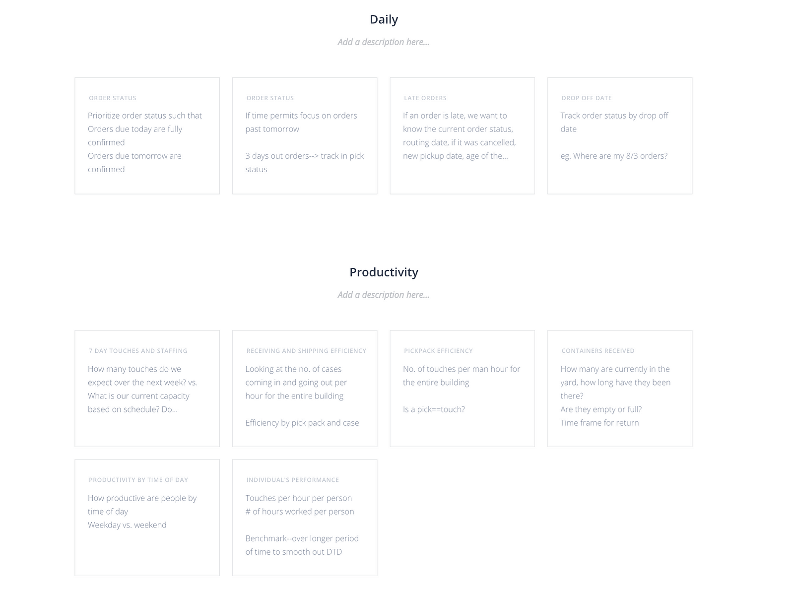
Since this was an agile delivery, I created user stories based on learnings from the interviews and prioritized them on a call with the stakeholders.
I also compiled my observations and critique about the existing application using a quick Powerpoint.
Since I had worked on an executive sales dashboard for the same client in the past I already had an understanding of how their business worked and was able to draw on that knowledge throughout the course of the project.
Key Data, Dimensions, Measures and KPIs
Dimensions
- Customer Group: A listing of all the distinct groups of customers, summarized as Walmart & Non-Walmart
- Order Class: Whether an order was Direct Shipping to the Distribution Center (DSDC) or Distribution Center Generated (DCGEN)
- On Time Status: The date a shipment must be completed by relative to today
- Tier: One of 7 customer categories, including Walmart, Growth, and Closeout
Measures
Count(Distinct(OrderID)): This was the main measure, used to show the number of orders in each dimension
Concept Generation and Validation
Each week we would pick a user story to address and I took the lead on brainstorming ideas to answer those questions.
The process of prototyping was very quick and dirty, with the idea being that we needed just enough design to convey ideas to users and developers to seek feedback on usefulness and feasibility.
Below are screenshots of our freehand board with which I would conduct remote sessions to validate ideas with our stakeholders.
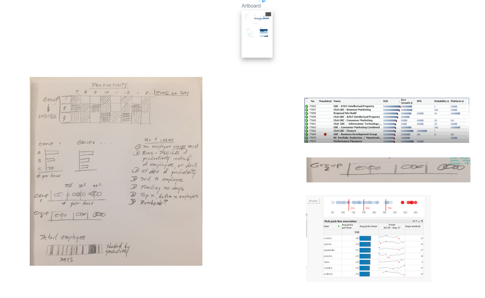
After getting feedback we’d quickly get into build mode where I would work with developers to realize concepts into Qlik View objects.
Application Design
The project was built using QlikView Desktop, and then deployed onto their server. The client would send us static csv files with the source data, and we would transform and reload against those. When it came time to validate, they would send us the latest csv’s, and we would compare numbers. We would send them the desktop version of our .qvw’s, and they would deploy this onto their server.
Key views:
- Data Dictionary — This screen provides a list of commonly used terms and their descriptions
- Daily Operations — This screen provides an overview of the current on-time status of each order, as well as its completion status. From this overhead view, you can drill into detail-level information
- Productivity — This screen provides a view of empty/full container status, as well as a breakdown of inbound and outbound cases over a weekly time period.
- DSDC Capacity — This screen provides two functions. On the left, it allows the client to see inbound picks over the upcoming week, and schedule potential picking capacity to meet that demand. The right half of this screen shows productivity breakdown by employee and by day, with the ability to drill into hourly detail.
Application elements
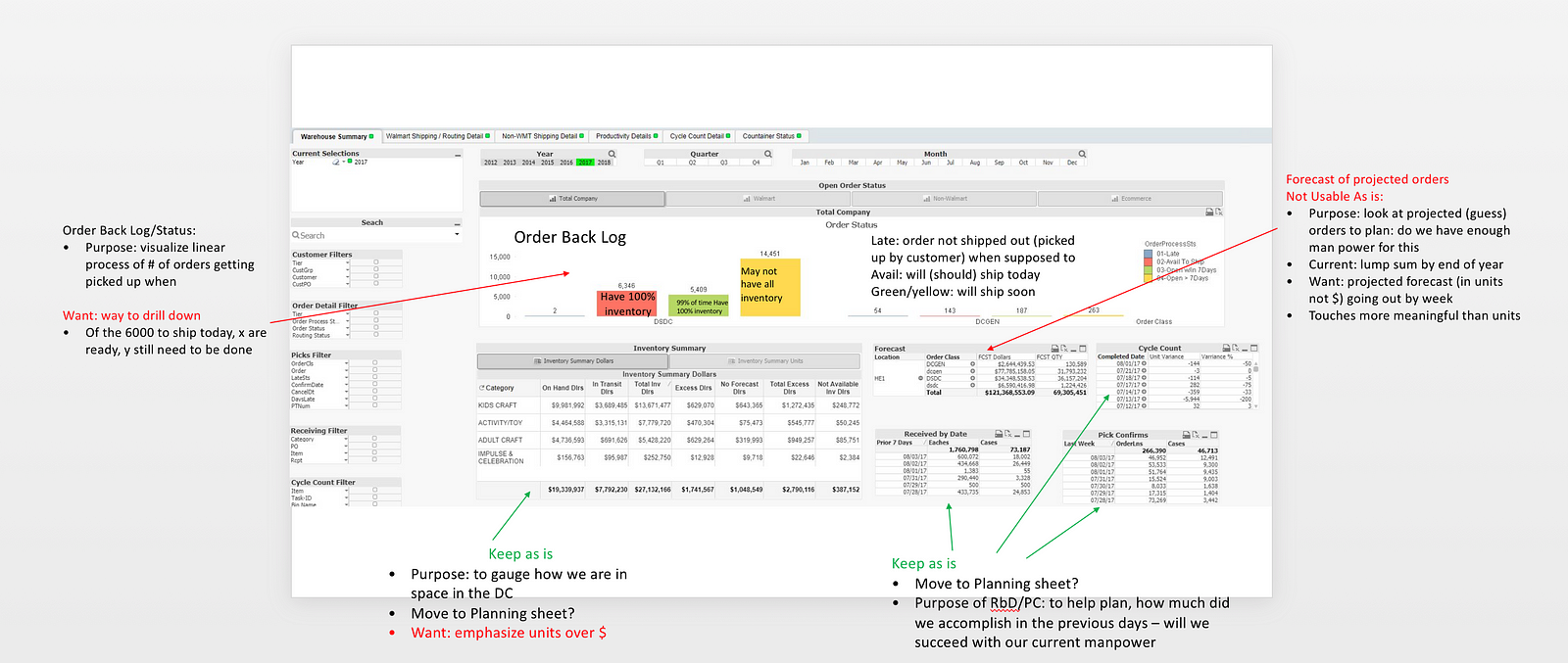
Open by On Time Status, Daily Operations Screen
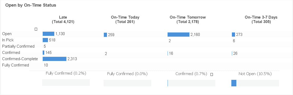
This object provides a view of ready statuses by on-time statuses. It brushes to selections, and allows you to drill into Cause of delay through another bar chart on the right.
The ready status shows what level of completion a pick is in, while the on-time status shows at which point the the pick will be considered ‘late’. The gauges beneath the chart show the percentage of all picks in the current on-time status which are sitting in the most important of the ready statuses for that time. The client really liked the quick glanceability afforded by the gauges, especially since there were so many day-to-day changes in order statuses.
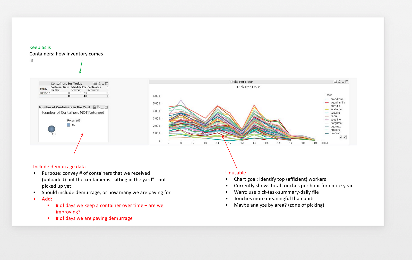
Empty/Full Container in Yard & Incoming Containers by Date, Productivity sheet
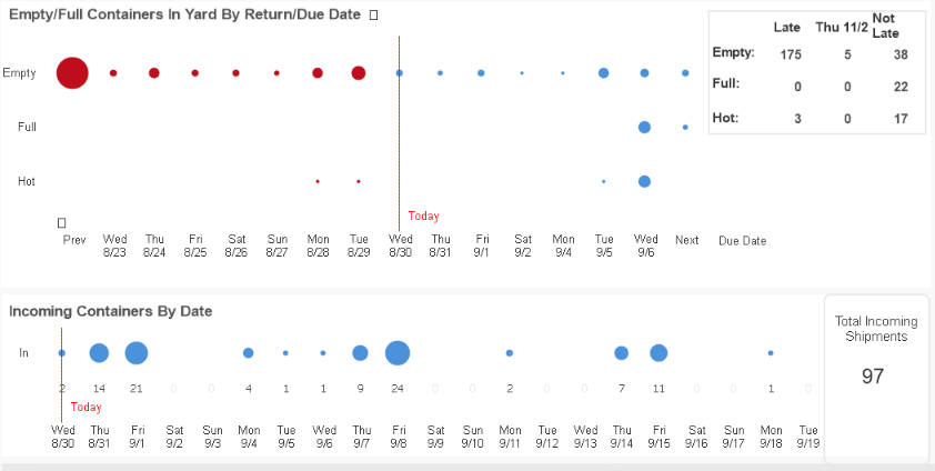
These objects provide a detailed view of incoming shipments, and whether they have been received or not. The lower dimension is a rolling week forward and week back, with a red line showing today. The size of each bubble reflects the number of container at that stage, and its position reflects its relationship to today. This chart allows the warehouse team to quickly identify containers that are ready to be returned and well past their due date as well as gauge how much space will be needed on the floor in the coming week.
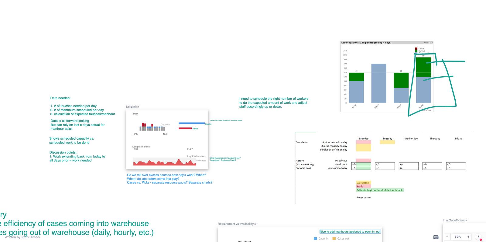
Warehouse Pick Capacity, DSDC Capacity Sheet
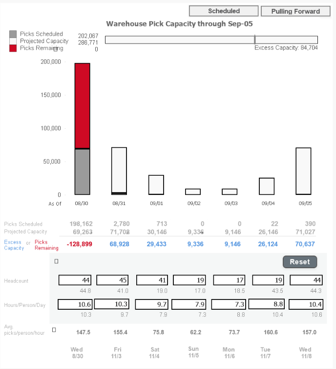
This object shows the picks scheduled for the next week, and then allows them to see different scenarios for potential capacity by changing the inputs below. They can then see whether they are likely to meet demand. They can view excess or shortage in a rolling (you can do tomorrows work today if you have extra time) or static manner.
Basically, this object allows for Horizon to conduct a what-if analysis of incoming work. The bar at the top shows completion by the end of the week, and the colored text shows each day’s projected capacity shortage or overage. Using both the bar at the top and the bars in the object, the client could see a high level answer to “will we finish all our work by end of week?” as well as the day-by-day process of meeting that capacity
The intent of this object was to provide the client with some potential for planning. They would have the benefit of being able to test multiple scenarios easily, and we would be able to demonstrate our abilities on producing a more complex object. The ‘scheduled’ view was relatively simple to build, while the ‘Pulling Forward’ view included more complex measures in order to show unfulfilled labor.
Productivity by Quartile, DSDC Capacity Sheet
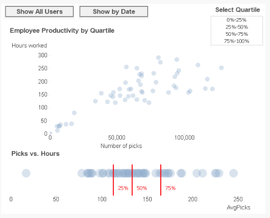
This object allows the user to see their most and least productive workers, and their most and least productive days. The object brushes, and you can make selections by quartile. Any selections here can then be used to view hourly productivity in a chart below, which was just a stacked line chart showing average picks per employee per hour.
Reflection
When we first started this project there was a lot of ambiguity and uncertainty around how this would shape since Axis’ usual design process tends to be more waterfall. At the outset, we did not know if we’d end up with individual objects or more cohesive screens and were pleasantly surprised when in the end we had two screens one focusing on Daily Operations and the other on Capacity Planning.
Daily Operations
Intent
- High Level view of current shipping status
- Ability to drill into lower level details
- Quickly be able to notice issues, and look into them at a click
Objects
- Trellised bar charts and gauges, showing completion status relative to due date
- Details table responding to selections
Capacity Planning
Intent
- Provide a glimpse into productivity and worker capacity
- Allow for a ‘What-If” scenario, where the user could test hypotheticals
- Analyze worker productivity by hour, weekday, and individual employee
- Provide a segue into predictive analytics
Objects
- Hypothetical bar chart on the left, deals with varying inputs
- Productivity distribution plots
Success factors
Having the CIO on our side was crucial to getting this app working. He needed this app to be finished so that CFO would have something to use before their busy-season. As such, he was quick to respond to inquiries, and in setting meetings with the CFO.
Challenges
Creating an Agile build strategy as we deployed proved to be a unique challenge. We had several meetings per day to check progress, and we were essentially designing and deploying at the same time.
Another challenge for was understanding the metrics they used. A majority of the descriptions and dimensions existed only on the .csv’s with no documentation. Oftentimes, even the employees of the company had little idea what a certain field or metric might mean, and we would need to go to Jim.
As such the developers had to do a lot of brain-picking with the CIO to get the details worked out and throw together a data dictionary. We eventually included that Data Dictionary in the final version of the app, just so that the client could have consistent documentation of the process.
Key takeaways
I have always been an advocate of following a ‘path of least resistance in prototyping’ and this project was a great example of how low-fidelity sketches could be made into workable objects without the need for detailed documentation.