Background
XYZ group is a supplier of Crafts and DIY kits to vendors such as Target, Walmart and Michaels.
And while XYZ had a Qlik View environment for their reporting needs they had little in-house Qlik development experience.
In the words of the CIO their dashboards were the “wild west” of Qlik dashboards where a single application could be a kitchen sink for far too many analyses.
This sentiment was echoed by the CEO who was vocal about the usability of the executive sales dashboard and how she gave up on trying to use it after a few tries because she just didn’t get it.
In order to alleviate some of this design debt, the CIO hired Axis Group to help re-design their executive sales dashboard.
This was a 2 week design engagement where I served as the Lead Designer and worked alongside a Design Architect who helped manage customer expectation.
This was followed by a development cycle where the application was built using Qlik View. During this phase I provided feedback to the development team so they could replicate the mockups as closely as possible in Qlik View.
Our Approach
Existing Dashboard Walkthrough
The first activity we conducted to kickstart the design was to sit down with the CIO and one of the Horizon Qlik developers to understand the rationale behind building the existing dashboard. Along the way I also made notes about important dimensions that helped me understand the business better.
Key business learnings:
- B2B seller of crafts and DIY supplies for
Kids and adults - Supplies to top-tier customers customers such as, Target, Walmart, Michaels & also other Growth accounts such as Amazon.com
Key dimensions
Product Brand
In-house brand or Licensed brand such as Miracle Grow or Barbie; a royalty fee is paid on licensed brand products
Inventory Location
- Domestic- Inventory received in the warehouse and then distributed out of warehouses to customers such as Target etc.
(Lead time of ~120 days to customer) - Direct Import- Inventory manufactured in overseas factories in China and shipped directly to the customer (Lead time of ~90 days to customer)
Product Hierarchy
Categories, Sub-Categories, Item
4 main categories
- Kits
- Kids
- Adult Craft
- Impulse (think of those small trinkets that are arranged as displays)
Categories are further divided into sub-categories
- Eg. Activity kits are sub-divided into Tween
- There is no, one criteria for this classification but typically based on target audience
- The list of subcategories is managed by IT
Replenishment/Promotion flag
Products are sold to customers in two ways
- Replenishment- items with a regular cadence
- Promotion- items with an irregular cadence
Inventory classification
- Pick-pack: where they fill a box with finished goods in different combinations
- Case in and Case out: Entire cases received and shipped out of the warehouse
Finer Detail
- Forecasts are revised monthly
- Per item per customer per month location type
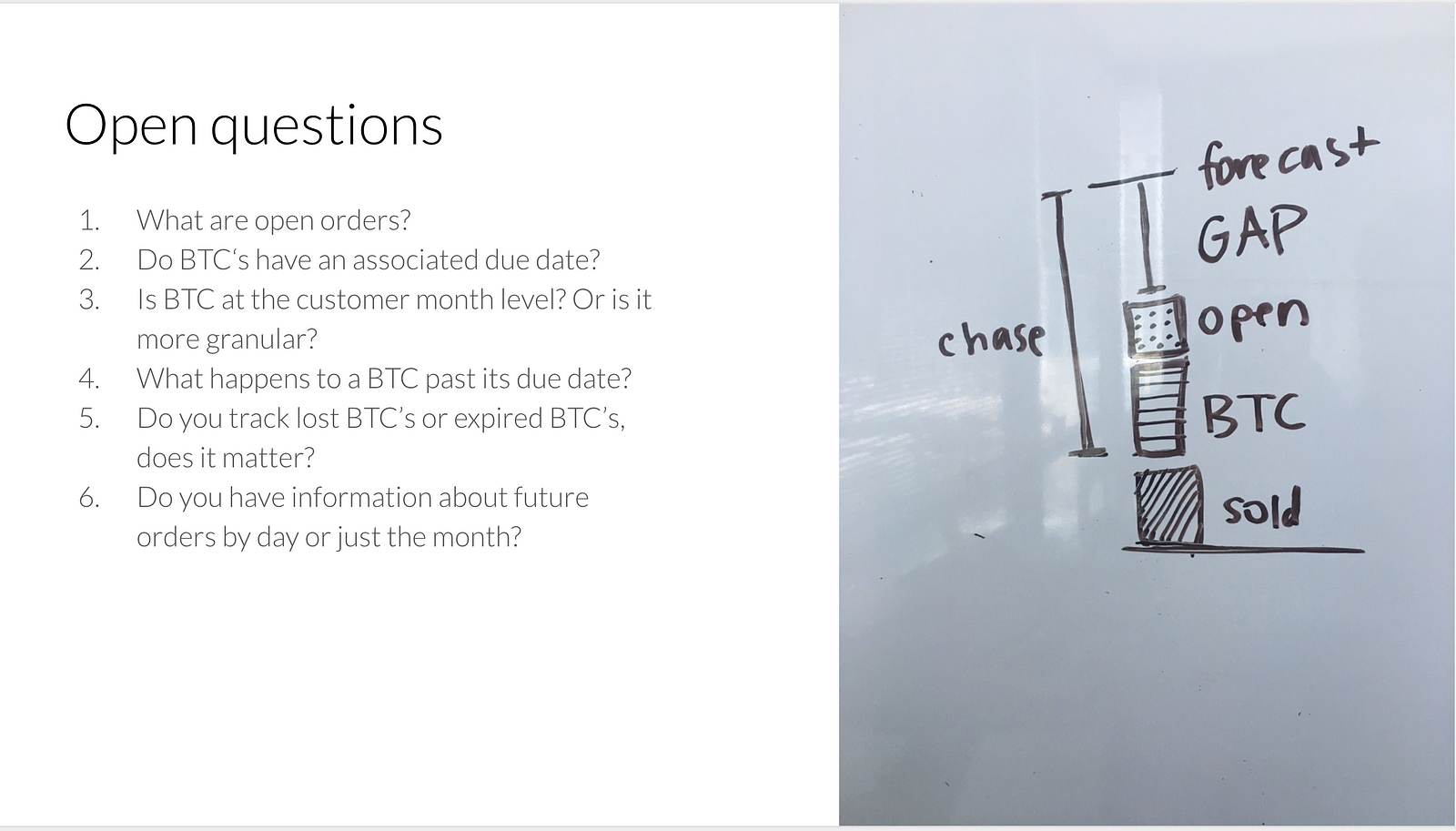
- Chase is the difference between MTD and Forecast value
- Part of Chase is BTC or Business to Come
- These are potential sales where you know whom you’re selling to and the overall sales $ but not what items (conservative margin estimates- uncertain)
- As such, you can’t prepare inventory as the orders tend to be a custom mix
Research Interviews
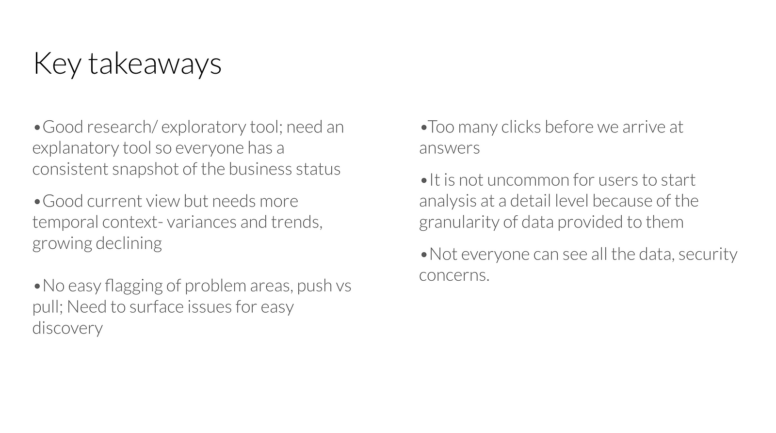
To gain a deeper understanding of usability issues we spoke to key users of the application as identified by the CIO from across the Executive, Marketing and Finance teams.
We conducted a total of 11 semi-structured interviews each lasting about 1 hour long.
Some of the key takeaways from the interview are summarized below:
Persona Development
I synthesized the notes from the interview into the following personas:
- Executive (Primary)
- Marketing (Secondary)
- Financial Reporting and Planning (Secondary)
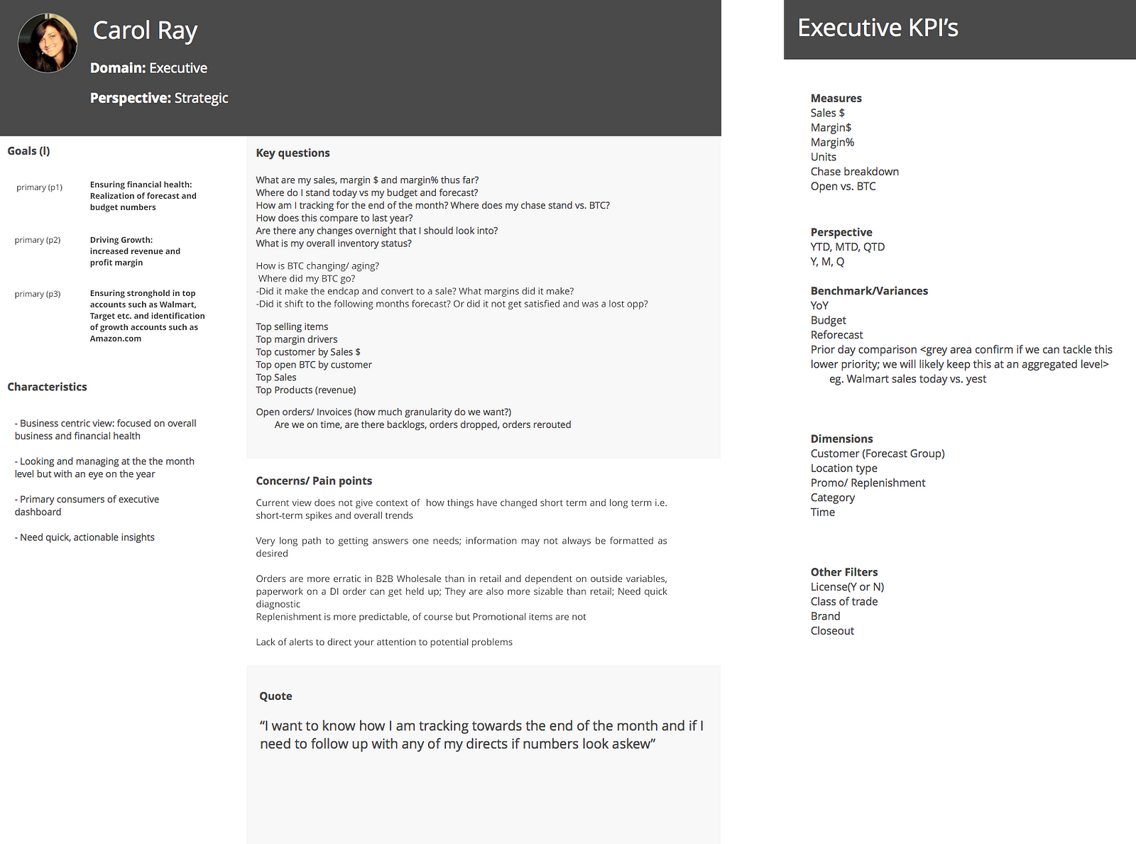
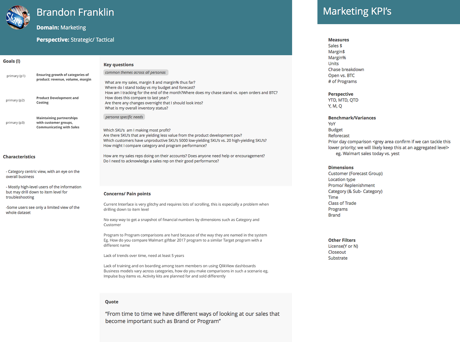
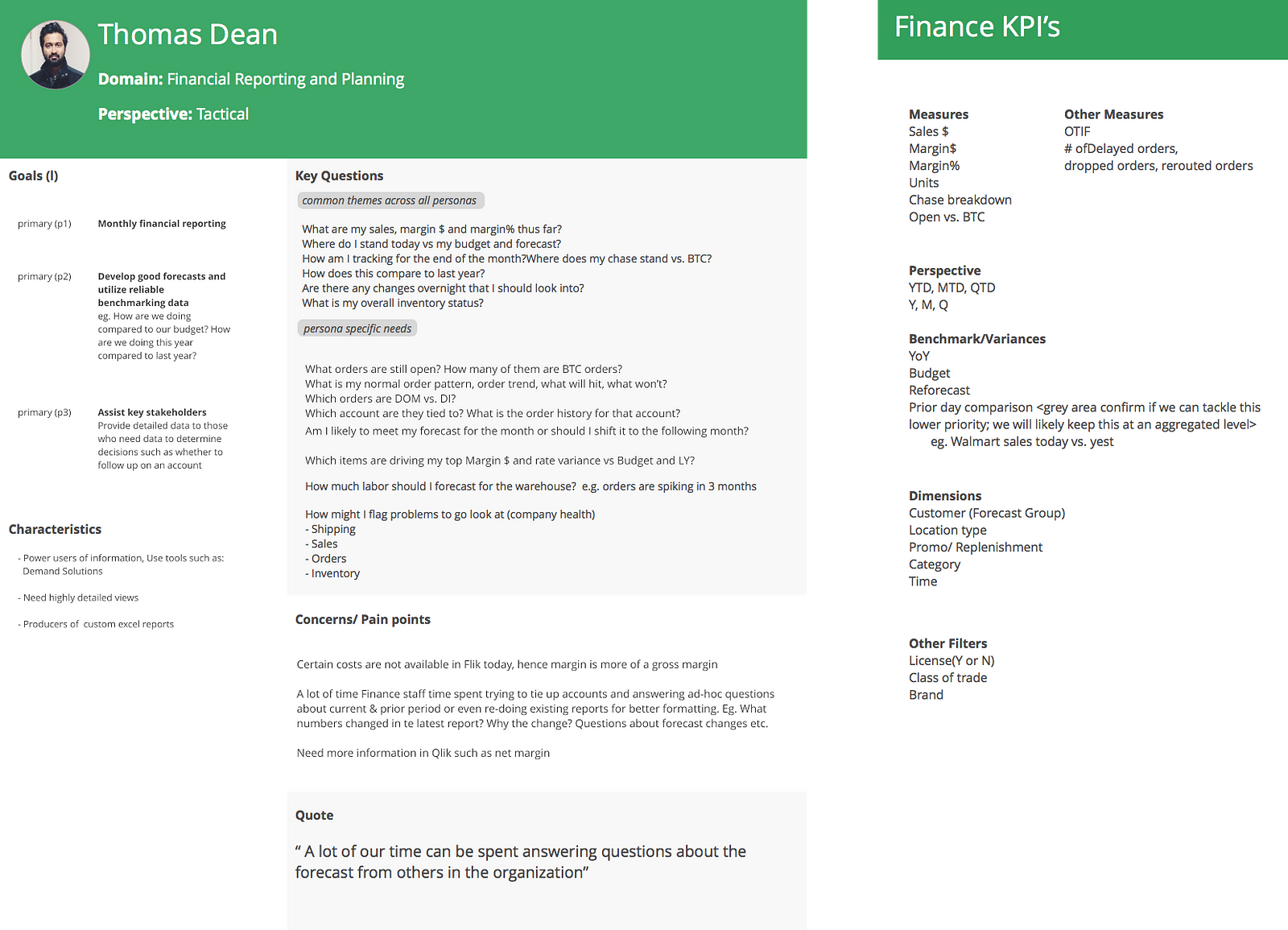
Each persona card lists key questions which drive the ideation phase forward. We decided to focus on the needs of our primary persona while still benefitting the secondary personas.
One of the key pain points of the Executive persona was how scattered the key business metrics were. We established the following design principles to help us make design decisions.
Guiding Design Principles
- Overview first; Breadth over depth
- Reduce the number of choices or selection a user has to make by setting good defaults
- Place these choices closer to the charts they affect for easy recognition
- Provide flexibility on demand- Additional filters available but hidden
Ideation
In order to get as many ideas as possible I decided to involve some of the other designers on the Axis design team by conducting a 2-hour brainstorming session.
While we tried to understand chase and business to come(BTC) we also generated some questions that we took back to the client.
Once I had filled in the designers on the context I suggested we diverge and brainstorm concepts in whatever medium suited us best(using sketches or Sketch app).
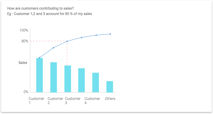
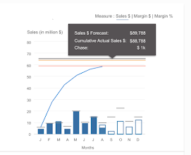
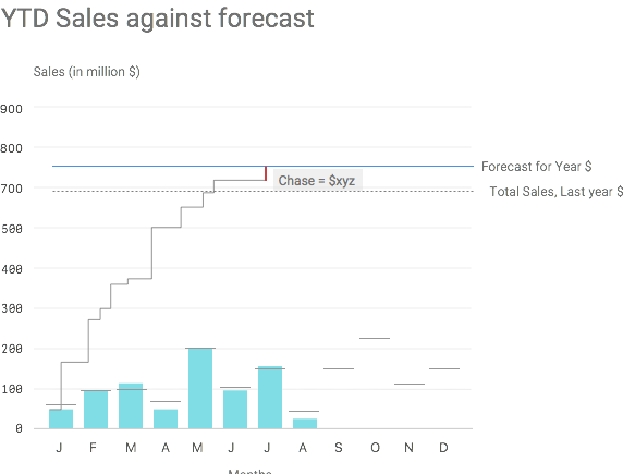
I really liked the idea of using a cumulative chart but instead used it to represent cumulative revenue over months so one could see how they were tracking against forecast as months progressed.
Mockups
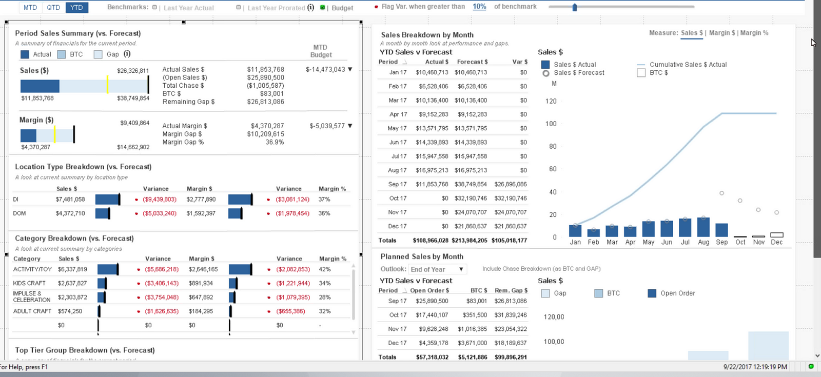
Executive Overview
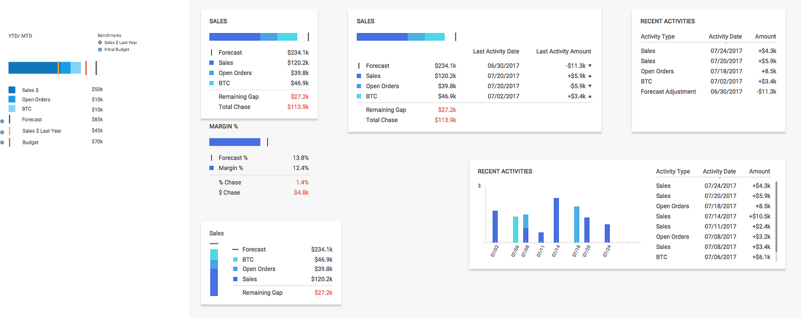
I then took these concepts and synthesized them into an Executive Overview screen and showed them to the CEO and other users.
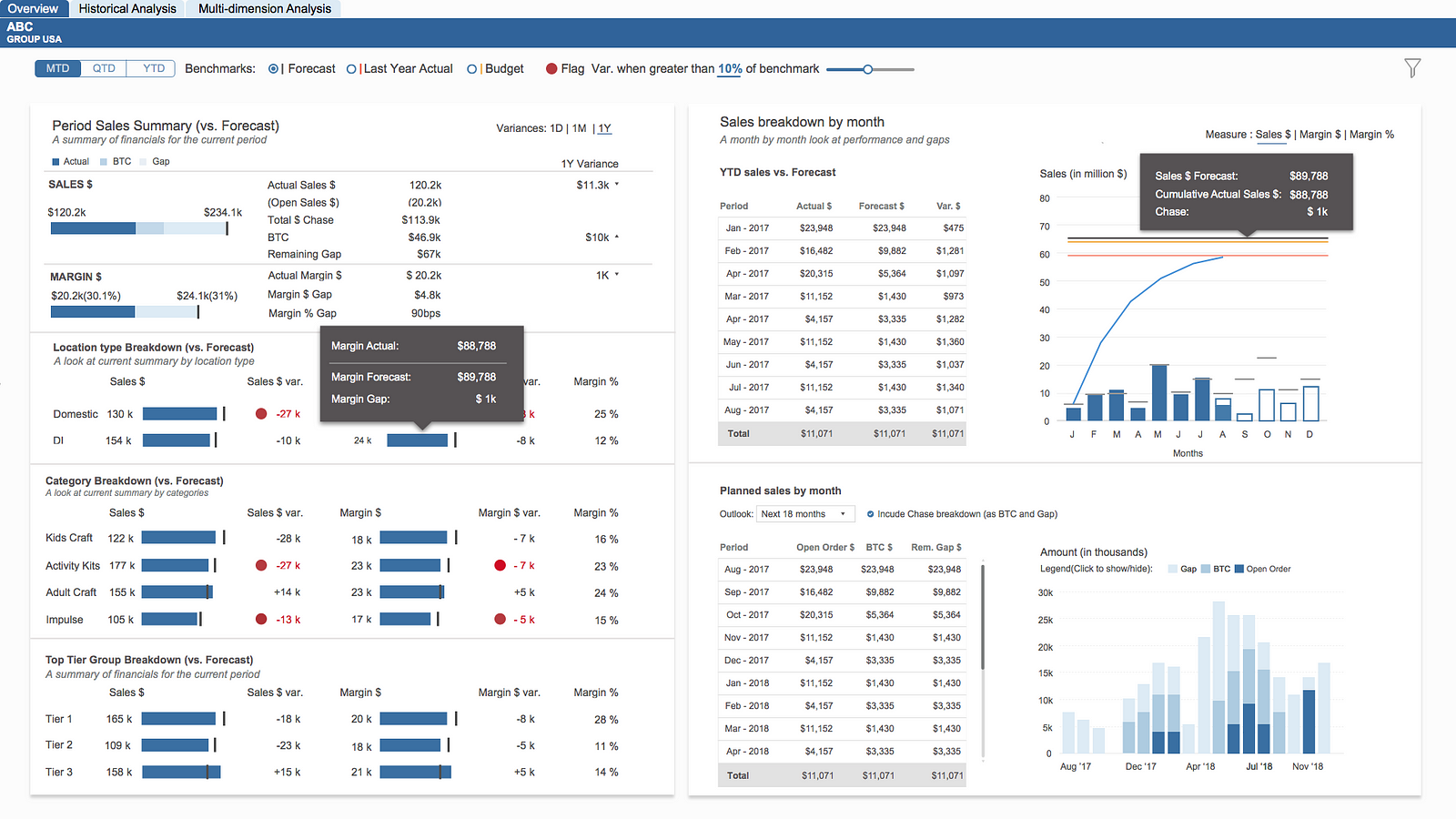
Overall they liked how the view lets you see most recent sales information at a quick glance, while also providing context in the form of prior period variances and monthly goals.
They also appreciated the overall minimal look and use of colors where the intensity of blue decreases as the certainty of sales decreases e.g. for BTC or business to come.
Some of the feedback they gave me was around adding two more benchmarks for Last Year Actual and Budget(this is set at the beginning of the year) in addition to the Forecast(this is revised monthly).
Since the right side of the screen was already data dense, we decided to provide a toggle using which one could select which benchmark they wanted to view.
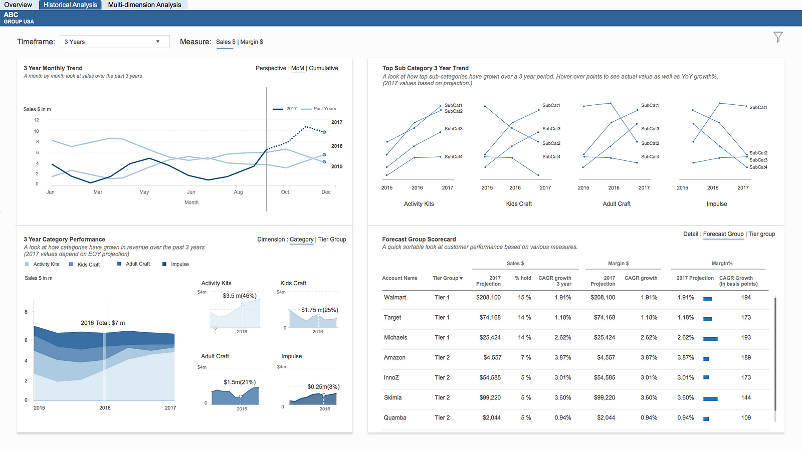
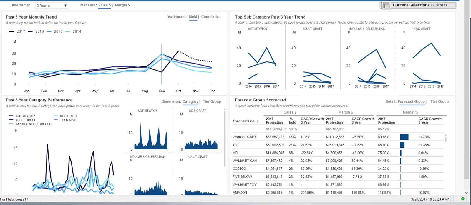
Historical Analysis
After seeing the executive overview screen there was a push from marketing to provide more trends for Categories and Sub-Categories as well as Customers(or Forecast Groups)because of which we created a Historical Analysis page.
We kept channels of feedback open on InVision and made iterations along the way
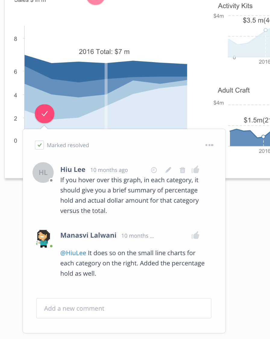
Towards the end of two weeks feedback from users started becoming sparse and there was a big push from the CFO to kick-off another project that they had an urgent need for.
As such, we decided to incorporate more changes during the development phase.
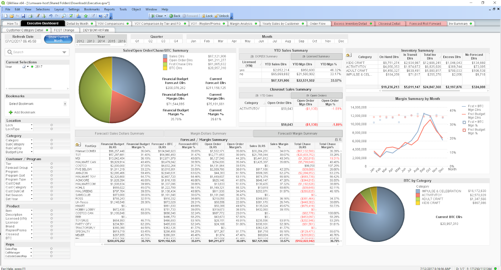
Development
I worked with our developer to help realize the designs in QlikView and make sure charts were built to spec.
Below are screenshots from some of our remote work-sessions:
During development we had to adjust some charts because of QlikView limitations for e.g. the sub-category trends below could not be labeled directly and so the developers suggested using a legend.
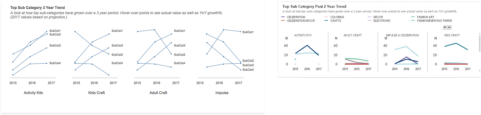
I wasn’t a huge fan of this and so we settled on showing category names on hover.
Impact
We presented our application to the CEO at the client company who was one of the intended users of the application. The application was well-recieved and having visibility to this data sparked more questions around the business. I went on to work on another design engagement for this client.