Background
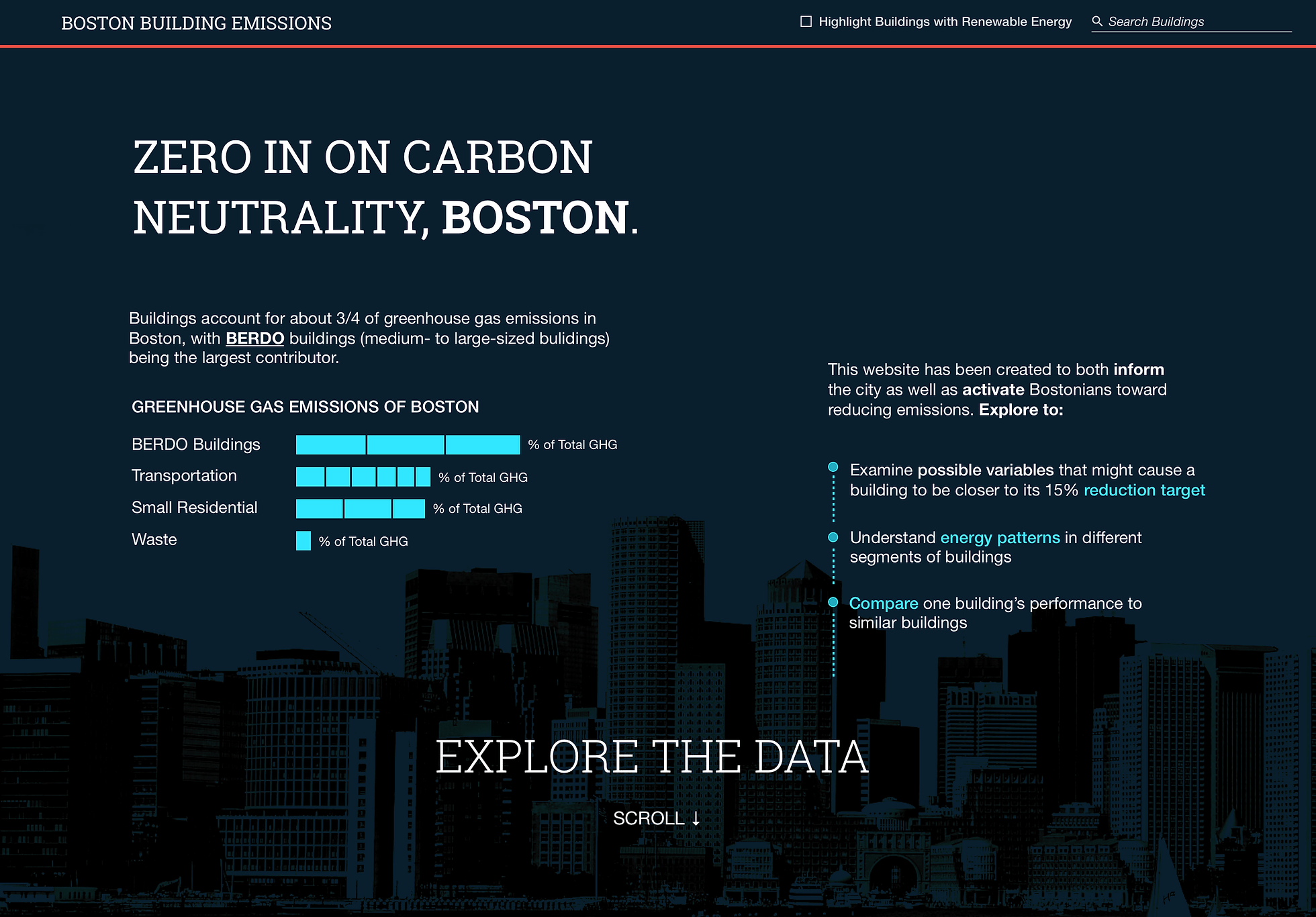
This application was built as part of a 2-week hackathon organized by Qlik called ‘Qlik Hack Challenge’. Our goal was to help visualize building emissions in Boston, which make up three-fourths of Boston’s greenhouse gas emissions.
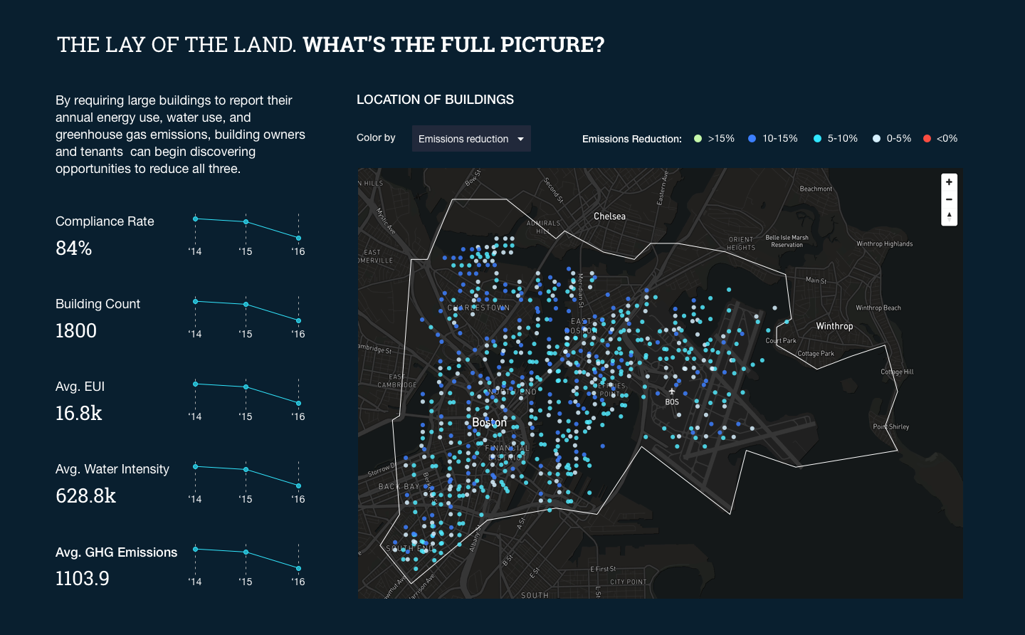
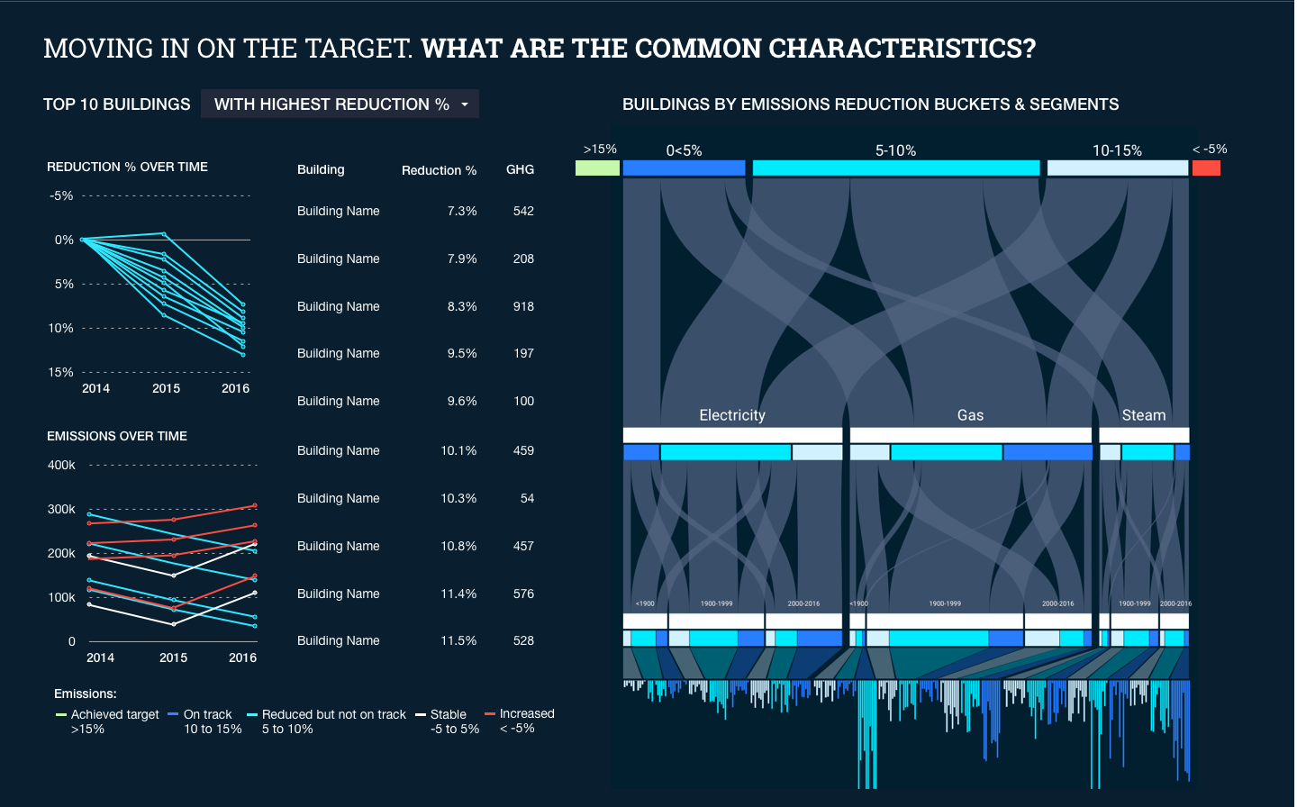
In 2013 Boston enacted the Building Energy Reporting and Disclosure Ordinance (BERDO) ordinance, requiring large buildings to report annual energy and water use to the City. Our goal was to build an app that helps identify which buildings and properties are meeting their emission reduction targets and see the broader trends that emerge in building performance over time.
The Team
We were a small but mighty team comprising designers, web developers and a data scientist. I was part of UX design team where we all worked together to brainstorm and ideate designs and worked with our engineering team to build a solution on a very short timeline.
Design Process
Based on the prompt, the primary users of this app would be city officials, building owners and residents. The following were some questions that these personas were looking to answer.
City-Wide Trends and Aggregate Analysis for a city official
-
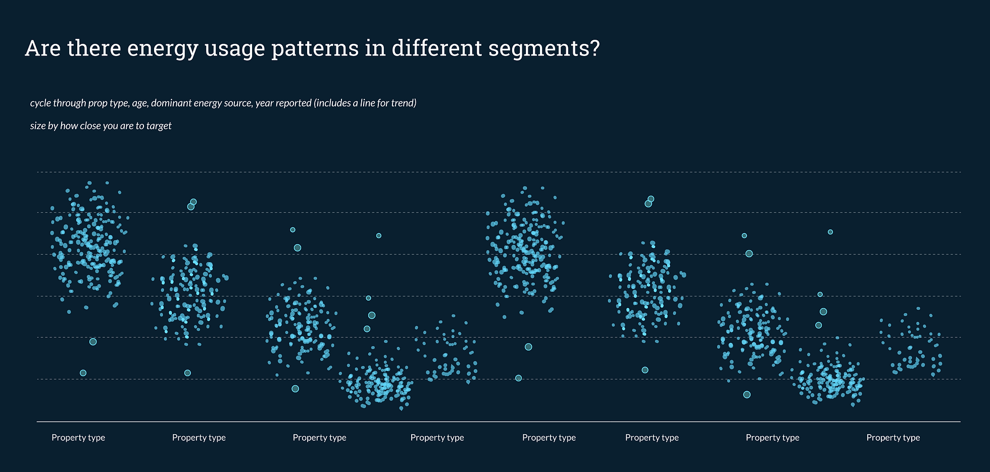
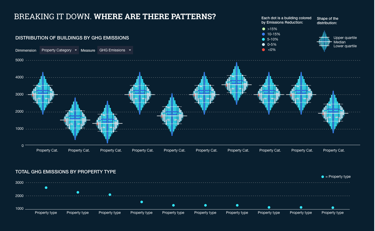
Are there energy use patterns in different building segments?
-
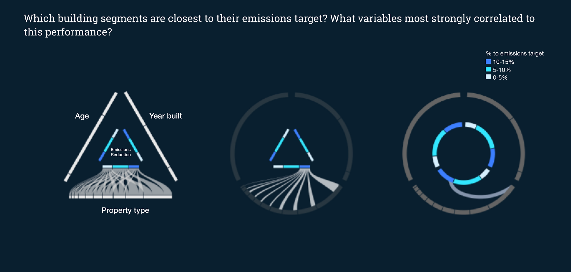
Which buildings segments are most energy-efficient? Which are least? What variables most strongly correlated with this performance?
-
Which buildings are anomalies?
-
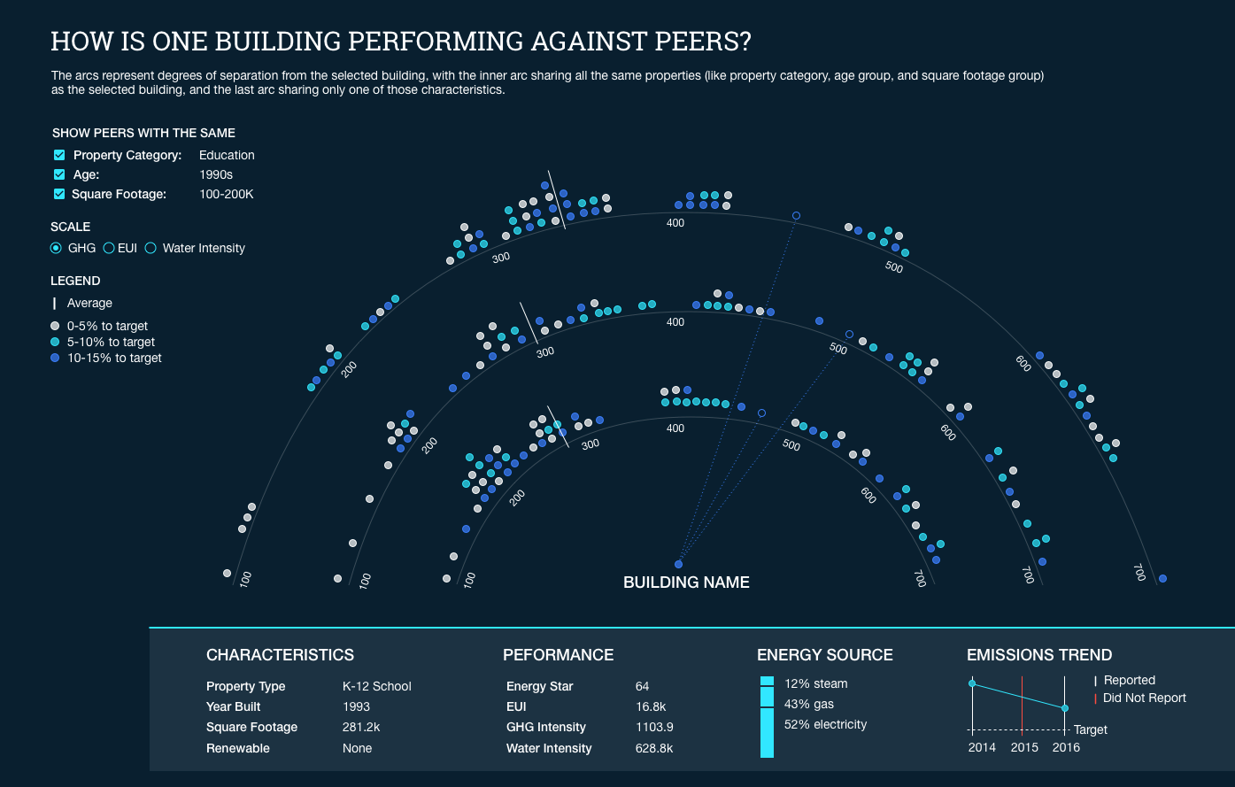
How is the building performing against peers?
Building-Level Reporting Assessment and Analysis for a building owner/resident
-
How is the building performing?
-
Did the building report data? Over what period?
-
How is the building performing against the 15% reduction target?
-
How is the building performing against peers?
-
Which buildings are performing most strongly against the 15% reduction target? Which could use additional support?
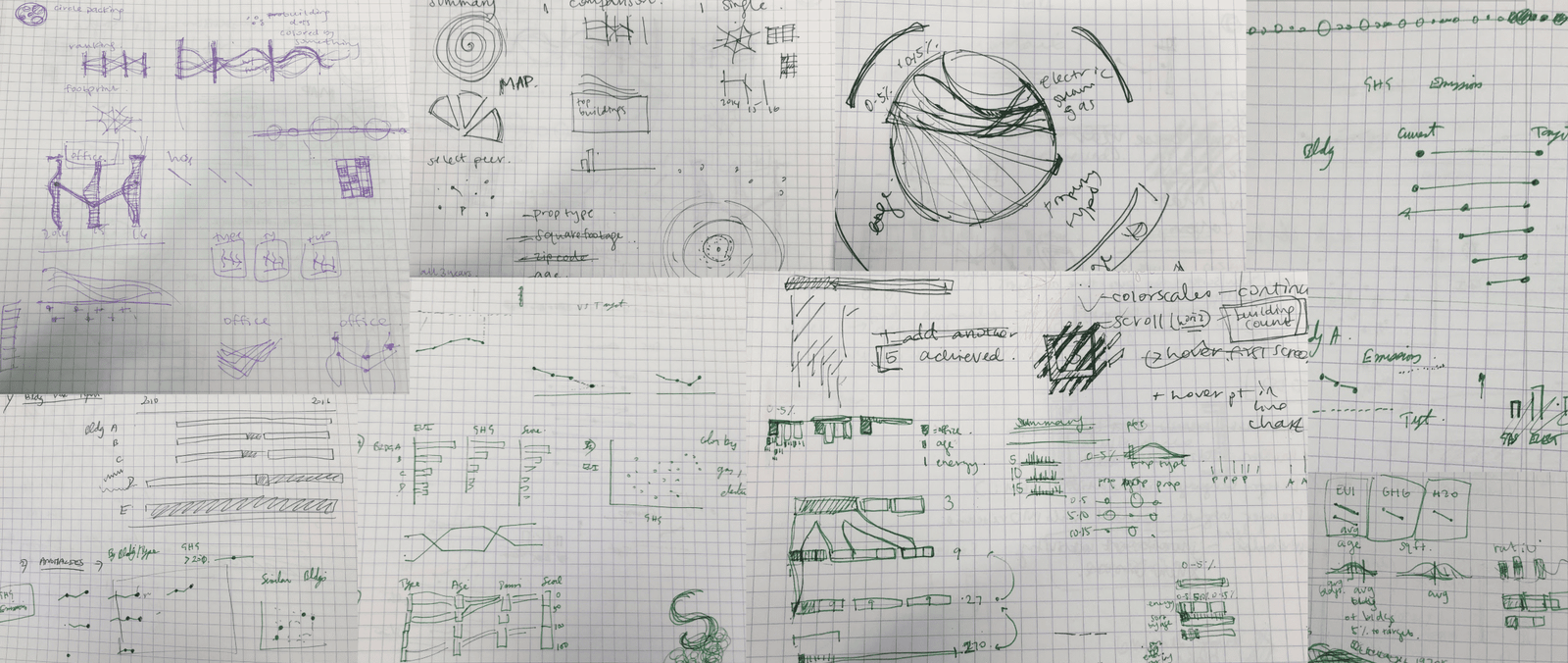
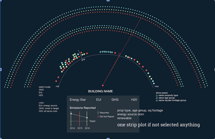
In week 1, the design team worked together to understand the data and produce divergent concepts to answer key questions about the data set. We looked at previous year BERDO reports to see what type of analyses had been done, sketched rough ideas and worked with our developers and data scientist to confirm the feasibility of our ideas. We conducted design reviews with the entire team to narrow down the narrative and visualizations and then produced mid to hi fidelity concepts for implementation. In week 2, we worked with the development team to refine refine visuals and to make adjustments where needed.
Below are some sketches and mid-fidelity prototypes that we created along the away with each concept trying to answer a key question.
Mockups
The design team divvied up the work to product a higher fidelity mockup of the final conepts. We each worked on a single panel that was focused on a key question. These panels were then arranged linearly in a single page layout. The overall flow of the page was to start at an aggregate level with high-lvel KPI’s and then breakdown to a more detailed analysis of individual buildings. As you flow from top to bottom the analysis becomes more and more granular.


Due to time constraints, we had to cut some panels during development. Also during development some concepts were tweaked in response to actual data and how it looked. View demo →.
Reflection
We were awarded the runner-up prize for our app at the 2018 Qlik Hack Challenge. I really enjoyed working on a cross-functional team and pushing ourselves creatively to come up with interesting visualizations while still focusing on the key questions to be answered.